How to Select Color Concept, Forms And Typography In Web Design
The first impression of a visitor to the site starting from the first 9 seconds. So how, with the calculation of the download time, a designer can draw the attention of the visitors? The answer is to design a "wonder".
The first impression of a visitor to the site starting from the first 9 seconds. So how, with the calculation of the download time, a designer can draw the attention of the visitors? The answer is to design a "wonder".
"No wonder" what I mean is as follows:
- Good color coordination
- layout (lay-out) is good,
- and most importantly, fast download.
- Color as a medium of illumination for the site and the information or product they have.
- Form, something that is often overlooked, is also a design element that is strong enough to form an image, and express an information.
- Typografi (art of typeface usage) currently has a limited implementation in web design, but it is a very important element in communication with the visitors.
1. color
Selection of color is one thing that is very important in determining the response from visitors. Color is the first thing seen by a visitor (especially the background color), and you can make your site to display the first color while the other content (text and images) is still in the process of downloading. This will make an impression or a mood for the entire site.
To achieve effective color design, can be started by selecting a color that can represent the purpose of your site. Color pallet that you created should match the person and purpose of your site. If for example your site is to a community site, then you should choose warm colors to make the atmosphere more relaxed. If your site is for information sites, where content will dominate, then the color should be simple and unobtrusive (eg do not use background kembang2 with flashy colors).
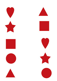
2. formForms can also be used to draw a response from visitors. Effective Use of Forms will psychologically motivate visitors, inspire visitors and provide a challenge to visitors, sometimes without realizing what motivated the visitors, etc.
Form, usually combined to make a stronger impression. For example the use of a Circle and a Seg iTiga, will produce the impression nergetic, and dynamic. Or the use of a circle and a square for the warmth and feeling of safety.
The shape and strength of the combination of forms has been addressed in various fields, such as Automotive, building of, Packaging Products, and Corporate Logo
3.Typografi
Typografi is an art. And is an art that is quite complicated, especially coupled with a medium complexity web design is limited. Fonts on the Web can be made as part of the graph (image), or by way of HTML, or with Style Sheets.
By the way HTML and Style Sheet, sometimes will didapakan unsatisfactory results or less good because of typefaces (form letter) that we use, may not be available at the visitor's computer. If a visitor's computer currently do not have form letters that have been set by the web designer, then that will be used is an alternative view using the form letter or form letter standard (default).
Designer can make choices about the letter that they make a graph (image), and also the general typeface used on the content of the text. So many forms of letters, to hard to say how many fonts that exist in this world.
So it's rather difficult to determine the effects / influence what can be caused to the visitor. However, the letters are divided into several general categories, and usually these general categories has its own style.
Typically, designers will use some kind of style letters on a page. Important Point Title and usually use this type of Decorative and scrip, and the contents of the text almost always have to use a type of Serif or San-Serif (or sometimes use a Monospace).
To affect the visitors in psychology, can by the use of Fonts in accordance with the objectives to be achieved by the use of color and form. How to Select Color Concept, Forms And Typography In Web Design
Tips By : Knowledge-Shared.blogspot.com
 6:08 AM
 indigo


